
https://www.asorry.com/pumas-1999-icons-reimagined-a-deep-dive-into-the-speedcat-and-mostro/
When minimalist aesthetics meets the monster soul of the 90s, the trend circle adds to the popularity of the joint venture. The cooperation between JJJJound and PUMA uses the Mostro shoe model as a carrier to collide the two brands’ completely different styles to create new sparks. This is not only the story of a pair of shoes, but also a rewriting of restraint, wildness and design language.
1. Is this collaboration a coincidence or a long-term plan?
JJJJound, a minimalist pioneer from Montreal, Canada, has frequently appeared in the joint lists of New Balance, ASICS, Vans and other brands in recent years, showing a consistent and stable design style – restraint, texture, and blank space. This time, they chose PUMA’s retro shoe Mostro , which seems to be the next node in the strategic chain.
Mostro, known for its “monster” spiked outsole and sporty silhouette since its debut in 1999, is a symbolic expression of PUMA’s technology and wildness. The core of JJJJound’s participation this time is to “aesthetically reduce the noise” of this ostentatious structure and give it a quiet texture – this is exactly what they are good at.
2. Wearing it on your feet is a low-key “rebellion”
1. Color and material: dark tones for a premium feel
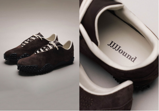
This collaboration provides two low-saturation colors, “Dark Chocolate” and “Deep Navy” , both of which are JJJJound’s signature silent color spectrum. The combination of suede upper and leather lining not only provides a warm touch, but also pulls the visual atmosphere to a higher-end aesthetic range – there are no bright colors, but it is durable and versatile.
2. Logo design: hide classics in details
The classic “Formstrip” on the side of the PUMA shoe body has been reconstructed into a dotted arrangement, breaking the constraints of traditional lines and no longer occupying the visual center, but leaving a trace as an invisible identification. The JJJJound Logo on the tongue, insole and heel has been simplified to the minimum, almost blending into the overall design without making a sound – truly “designed only for those who understand”.
3. The “Monster” gene is still there: the outsole is the continuation of the attitude
Despite the minimalist appearance, the sole still retains Mostro’s signature spike structure. This is not only a tribute to history, but also ensures that this pair of shoes is both functional and recognizable. It is not a pair of shoes born for showmanship, but it knows how to retain the “soul of the monster”.
3. Release method: precise rhythm and meticulous scene construction
1. Europe first, then global expansion
According to official information, this collaboration will first land in the European market on June 14, 2025 , with a price of approximately US$160, and will be rolled out globally through the JJJJound official website and PUMA channels shortly thereafter.
2. Scene creation, from “Mostro House” to conceptual space
The first appearance was during Paris Fashion Week, in the “Mostro House” exhibition space opened by PUMA. The scene layout was dominated by minimalist lines and gray tones, with old equipment and conceptual installations, simulating the creative language field of JJJJound. Previously, Shanghai also had a limited-time space, continuing this visual construction strategy of “quiet but with tension”.
This type of exhibition emphasizes aesthetic immersion rather than commodity consumption. It allows consumers to understand the design through experience rather than just placing an impulse order.
4. Why does this pair of shoes embody the “JJJJound philosophy”?
The materials are exquisite but not noisy : suede and leather are mixed, and the dark tones show a sense of layering. The overall look is low-key but not dull.
Visually minimal but with a hint of meaning : Formstrip’s dot matrix design and micro-logo approach are an “encrypted” expression of the brand’s identity.
Keep the prototype but give it a new context : Mostro’s original structure remains unchanged, only the expression method is changed – from wild and extrovert to restrained and sharp.
This translation ability is exactly what JJJJound is best at: retaining the outline and reinterpreting it, thereby completing an upgrade of the “design temperament”.
5. What is the difference with the collaboration with the Suede series?
Previously, JJJJound and PUMA’s collaboration on Suede (such as the China-exclusive gray and khaki models) emphasized “creative progress in the social era” and the design tended to be symbolic and conceptual. This time, the Mostro collaboration is closer to the product positioning of internationalization and functionality.
| project | Suede collaboration | Mostro collaboration |
| Design Theme | Creative process, web symbols | Minimalist style, blank structure |
| Color | Gray, khaki and other single tones | Dark chocolate, dark navy |
| Display method | Limited Release + Domestic Concept Space | Paris Fashion Week + Global Market Synchronous Layout |
6. Is it worth buying? Five dimensions for your reference
| Dimensions | advantage | Tips |
| Design | Minimalist yet full of structural tension | Users who don’t like dark tones may not be able to adapt |
| Material | Suede + leather, high-quality presentation | Easy to attract dust, requires regular maintenance |
| Comfort | Retains the Mostro bottom structure, suitable for daily wear | Not very suitable for rainy days or outdoor activities |
| Scene Adaptation | From street wear to semi-formal wear, it can handle | The “monster bottom” shape is hardcore |
| Collection Value | Limited edition + brand topic support | Black market or secondary market prices fluctuate greatly |
7. Conclusion: Low-key collaboration can also arouse deep resonance
The JJJJound x PUMA Mostro collaboration, on the surface, is a work of simple design and restrained colors, but in fact it is a deep response to shoe culture – it rejects the trend bombardment of “visual fatigue” and instead seeks the rhythm between structure, material and emotion.
This “minimalist monster” expression builds an intriguing bridge between design and consumption. It does not make a loud noise, but leaves a lasting mark in the wearer’s daily life.
https://www.asorry.com/pumas-1999-icons-reimagined-a-deep-dive-into-the-speedcat-and-mostro/